I make apps, take a look 👇
Beautiful images of code
Generate gorgeous, highly customizable images from your code snippets. Ready to save or share.
Migrating away from DevMate: redirecting Sparkle updates
Originally appeared on dangercove.com
DevMate is the service I use to gather download and install statistics for most of my apps. It also serves the update feeds for all non-Mac App Store apps. Earlier this year DevMate announced its retiring the platform in December.
In this post I’ll outline how I’m preparing my apps to migrate to a new update feed. Christian Tietze mentions asking DevMate to point the Sparkle update feed to a new location. He also recommends to not rely on DevMate’s redirect to work forever. That’s where my approach comes in.
I urge you to take control over the feed URL entirely and redirect it yourself. DevMateKit uses Sparkle under the hood. This means a custom update URL can be specified by implementing a Sparkle delegate method.
Setting the URL
class ApplicationCoordinator: NSObject, Coordinator {

  ...

  private func configureUpdates() {
    DM_SUUpdater.shared().delegate = self
  }
}

extension ApplicationCoordinator: DM_SUUpdaterDelegate_DevMateInteraction {
    func feedURLString(for updater: DM_SUUpdater) -> String? {
        if Defaults.shared.isEnabled(setting: .betaUpdates) {
            return .appcastBetaURLString
        } else {
            return .appcastURLString
        }
    }
}

extension String {
    static let appcastURLString = "https://updates.dangr.co/\(Bundle.main.bundleIdentifier!)/appcast.xml"
    static let appcastBetaURLString = "https://updates.dangr.co/\(Bundle.main.bundleIdentifier!)/beta-appcast.xml"
}
After this change Timeless will check for updates at:
https://updates.dangr.co/com.dangercove.Timeless.Mac/appcast.xmlThe
updates.dangr.codomain is mine and I can set redirects for it however I want.Redirecting
I use Netlify to handle the redirects. Here’s what that looks like:
com.dangercove.Timeless.Mac/appcast.xml*      https://updates.devmate.com/com.dangercove.Timeless.Mac.xml:splat       301
com.dangercove.Timeless.Mac/beta-appcast.xml* https://updates.devmate.com/beta/com.dangercove.Timeless.Mac.xml:splat  301
As you can see I currently redirect to the feed at DevMate, but I can redirect it anywhere else whenever I want. This allows me to use DevMate for as long as possible and switch to any other service that uses Sparkle. I’m keeping a close eye on App Center by Microsoft. They put Sparkle feeds for macOS on the roadmap for September.
Fix "mapped file has no Team ID and is not a platform binary" in Xcode 11
After applying the preferred project settings in Xcode 11 you might be confronted with the following error while loading a Library at runtime:
dyld: Library not loaded: @rpath/DCOAboutWindow.framework/Versions/A/DCOAboutWindow
  Referenced from: /Users/username/Library/Developer/Xcode/DerivedData/Pipvid-adwfbkaurzovizgaarwkmugeihce/Build/Products/Debug/Pipvid.app/Contents/MacOS/Pipvid
  Reason: no suitable image found.  Did find:
	/Users/username/Library/Developer/Xcode/DerivedData/Pipvid-adwfbkaurzovizgaarwkmugeihce/Build/Products/Debug/Pipvid.app/Contents/MacOS/../Frameworks/DCOAboutWindow.framework/Versions/A/DCOAboutWindow: code signature in (/Users/username/Library/Developer/Xcode/DerivedData/Pipvid-adwfbkaurzovizgaarwkmugeihce/Build/Products/Debug/Pipvid.app/Contents/MacOS/../Frameworks/DCOAboutWindow.framework/Versions/A/DCOAboutWindow) not valid for use in process using Library Validation: mapped file has no Team ID and is not a platform binary (signed with custom identity or adhoc?)
The issue is caused by a new entry in your
project.pbxprojthat specifies the signing identity:CODE_SIGN_IDENTITY = "-";. It’s set to Sign to Run Locally by default.Changing Signing Certificate to Development under Signing Capabilities in the project settings resolves the issue. You could also manually update the entry to
CODE_SIGN_IDENTITY = "Apple Development";.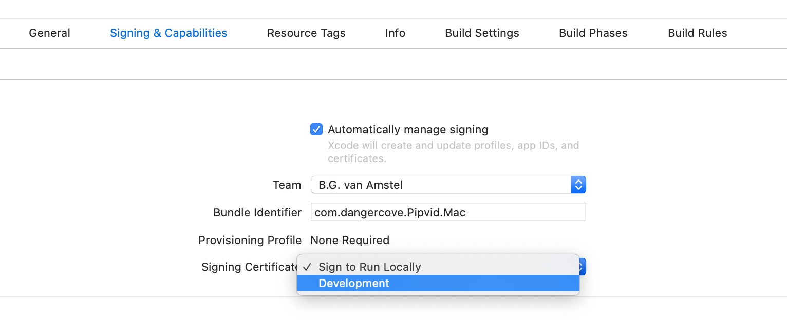
Related content with Jekyll and other Liquid tricks
This article originally appeared on dangercove.com
As promised, in this second part of the website redesign story I’ll go over the technical details of the changes I made to dangercove.com.
Stack & frameworks
To get a sense of how the website’s built, here’s an overview of what I use to layout and serve its content.
It’s a simple setup. The entire site is statically generated by Jekyll and then served by Netlify. Bulma is a CSS framework that allows me to style templates quickly.
Homepage
Let’s take a look at the homepage first. The list of apps is generated by including the
app/overview.htmltemplate and assigning it a set of apps pages.{% assign live = site.pages | where: 'layout', 'app/live' %} {% assign announced = site.pages | where: 'layout', 'app/announced' %} {% assign apps = announced | concat: live %} {% include app/overview.html apps=apps %}I fetch the apps to display by querying
site.pagesfor pages that use theapp/liveandapp/announcedlayout. Then I concatenate both arrays into a singleappsvariable and pass that to the includableapp/overview.htmltemplate.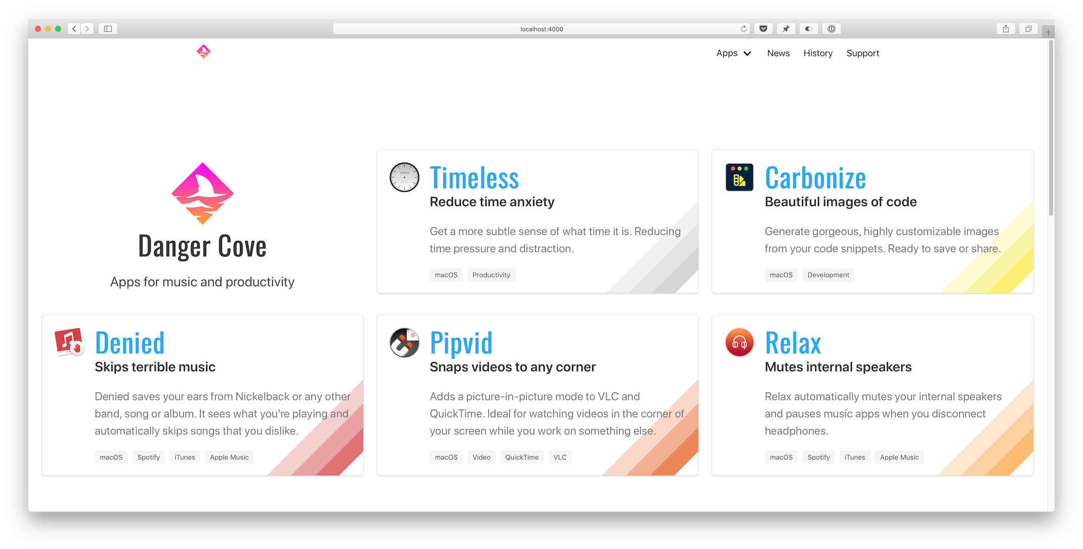
Overview template
The
app/overview.htmltemplate checks if it’s on the homepage (if page.layout == "home") and adds the Danger Cove logo accordingly.... {% if page.layout == "home" %} <div class="column is-4-widescreen is-half-desktop is-full-tablet is-full-mobile"> <div class="box is-shadowless has-text-centered"> {% include logo/retro.html %} <h1 class="title is-size-2-mobile is-1 is-spaced">{{ page.title }}</h1> <h2 class="subtitle is-size-5-mobile is-4">{{ page.subtitle }}</h2> </div> </div> {% endif %} ...Then it loops over the provided apps and includes
app/introduction.htmlfor each. This is the actual visual representation of the app, in the form of a card. Pulling it out into a separate include makes it trivial to display the app card anywhere else. I’ll use it again when showing related apps with blog posts. More on that a little further down.... {% for app in apps %} <div class="column is-4-widescreen is-half-desktop is-full-tablet is-full-mobile"> {% include app/introduction.html app=app %} </div> {% endfor %} ...Notice the convenient column CSS classes that Bulma provides. It’s trivial to scale the layout from mobile to widescreen devices.
Front matter
The
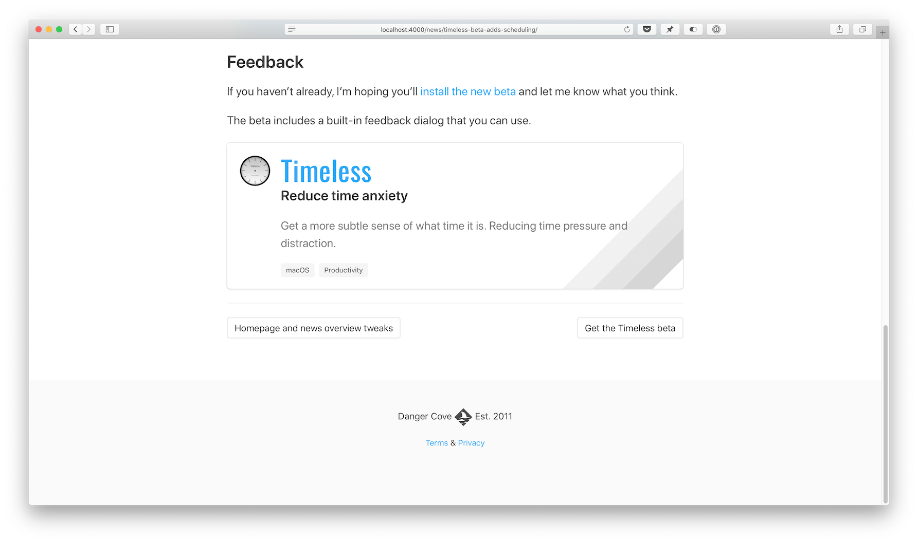
app/introduction.htmltemplate pulls the title, subtitle, description and colors from the app’s front matter. This is what the front matter for Timeless looks like:--- layout: app/announced site_title: Don't get distracted by time title: Timeless subtitle: Reduce time anxiety description: >- Get a more subtle sense of what time it is. Reducing time pressure and distraction. date: 2018-07-18 icon: timeless-clock_512.png hero: icon: timeless-clock_512.png dominant_color: r: 200 g: 200 b: 200 features: - Specify several, customizable 'time segments'. - Indicates the current segment in the menu bar. - Display the actual time and date with a single click. tags: - macOS - Productivity topic: timeless mailchimp: interests: [2] permalink: /timeless/ ---Every card shows a specific rainbow of colors in its bottom right corner. Storing this information in the page’s front matter allows me to pull it out in the template and apply per-app design details.
{% assign color = app.hero.dominant_color %}
<div class="box" style="background-image: linear-gradient(135deg,
transparent 80%,
rgba({{ color.r }}, {{ color.g }}, {{ color.b }}, 0.25) 80%,
rgba({{ color.r }}, {{ color.g }}, {{ color.b }}, 0.25) 85%,
rgba({{ color.r }}, {{ color.g }}, {{ color.b }}, 0.5) 85%,
rgba({{ color.r }}, {{ color.g }}, {{ color.b }}, 0.5) 90%,
rgba({{ color.r }}, {{ color.g }}, {{ color.b }}, 0.75) 90%,
rgba({{ color.r }}, {{ color.g }}, {{ color.b }}, 0.75) 95%,
transparent 95%)
;">
...
It’s hard to get around using
style=""for this loop. On the app’s landing pages I apply the colors to a generic CSS class that I can use in the template.... {% if page.hero.dominant_color %} {% assign color = page.hero.dominant_color %} <style> .hero-app { background: linear-gradient(35deg, transparent 60%, rgba({{ color.r }}, {{ color.g }}, {{ color.b }}, 0.25) 60%, rgba({{ color.r }}, {{ color.g }}, {{ color.b }}, 0.25) 70%, rgba({{ color.r }}, {{ color.g }}, {{ color.b }}, 0.5) 70%, rgba({{ color.r }}, {{ color.g }}, {{ color.b }}, 0.5) 80%, rgba({{ color.r }}, {{ color.g }}, {{ color.b }}, 1) 80%, rgba({{ color.r }}, {{ color.g }}, {{ color.b }}, 1) 90%, transparent 90%); } ...Setting
class="hero-app"atomatically applies the rainbow background for each app.News overview
Before:
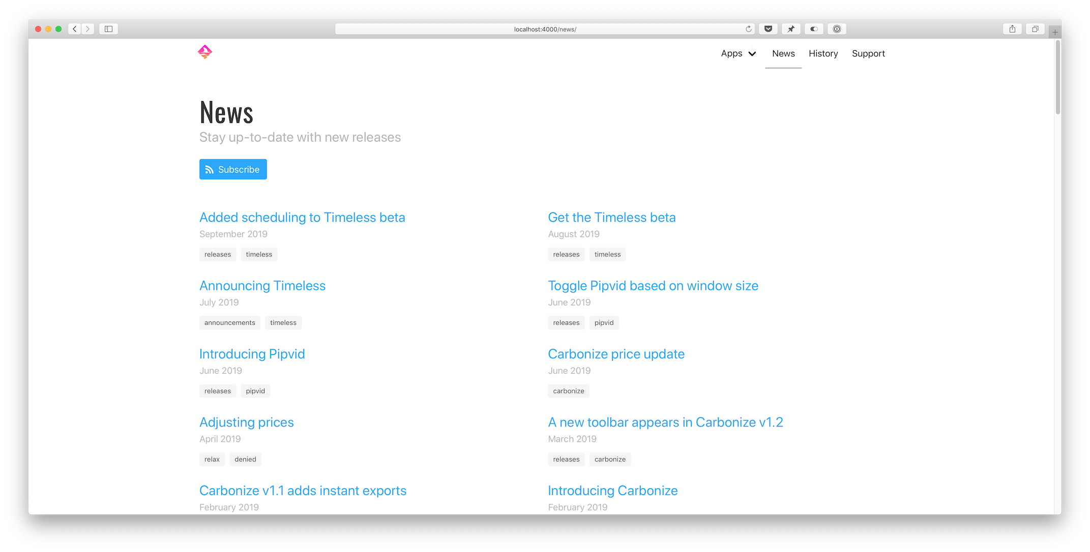 After:
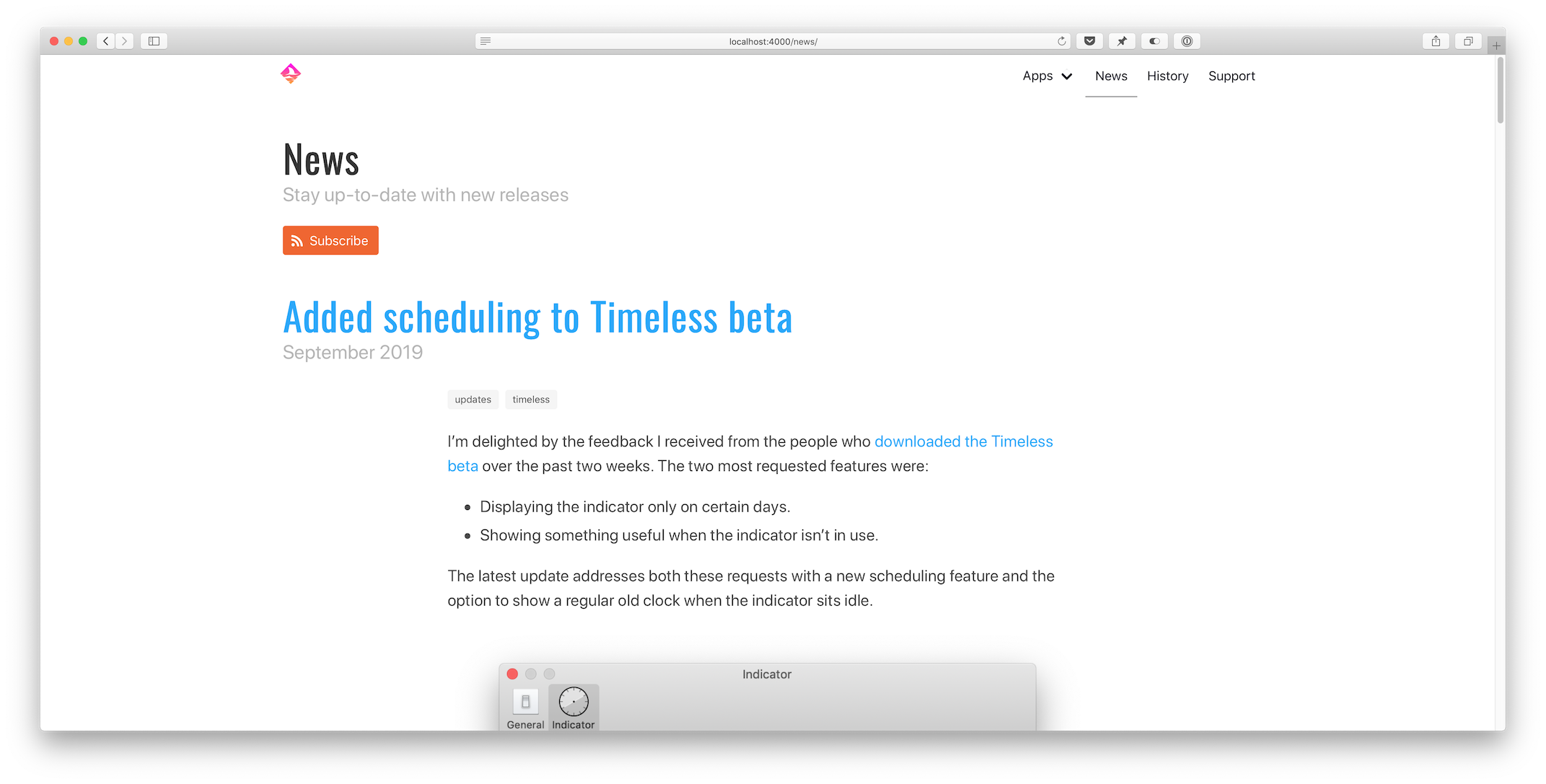
Pagination
Loading all posts on the
/newspage would be madness. The first step I took was to implement thejekyll-paginate-v2plugin:- Add
gem "jekyll-paginate-v2"toGemfile:group :jekyll_plugins do ... gem "jekyll-paginate-v2" end - Activate the plugin in
_config.yml:plugins: ... - jekyll-paginate-v2 pagination: enabled: true sort_reverse: true # Required in my setup to order posts from new to old permalink: "/page/:num/" - Add pagination settings to the
news.markdownfront matter:--- ... pagination: enabled: true per_page: 5 ---
The pagination plugin is ready to be implemented in
_layouts/news/home.htmlat this point. It comes down to two things:- Replacing
{% for post in site.posts %}with{% for post in paginator.posts %}in the template. - Including the paginator controls somewhere on the page.
Full post content
I updated
_includes/post/preview.htmlto show the entire post instead of just a preview. That’s it.Related apps
This new feature uses some front matter magic to allow me to pull in related content with a blog post. Consider the
_includes/post/related.htmltemplate:{% assign tags = include.tags %} {% for tag in tags %} {% assign app = site.pages | where: 'topic', tag | first %} {% if app %} {% include app/introduction.html app=app %} {% endif %} {% endfor %}Usage:
{% include post/related.html tags=post.tags %}It loops through all tags assigned to a post and then searches
site.pagesfor a page that has atopicthat matches thetag.Imagine I write a post about Timeless and tag it like this:
---
...
tags: [updates, timeless]
...
---
If you look in the front matter for Timeless above, you’ll notice its topic:
---
...
topic: timeless
...
---
The
appvariable gets assigned and theapp/introduction.htmlcard template gets included. If the tags include multiple apps, each is shown.Open-source
The full source code for dangercove.com is available on GitHub. For a comprehensive list of all changes made for this redesign, take a look at this diff: 3493aae..4518428
I hope you enjoyed this in-depth look at how I keep dangercove.com up-to-date. If you have any feedback, questions or comments let me know on Twitter.
- Add
Fake GBA carts
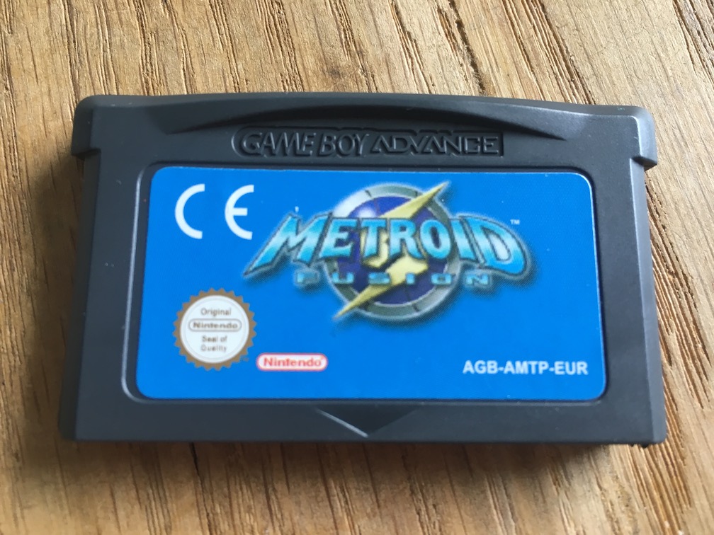
I’m selling all my Game Boy Advance carts. While taking pictures I noticed two cartridges looking a little off. The logos on both Metroid Fusion (AGB-AMTP-EUR) and Final Fantasy VI Advance (AGB-BZ6P-EUR) seemed fuzzy.


That’s not a good sign and I decided to open them up and take a look at the circuit boards.
Here’s a picture of an authentic, Nintendo manufactured circuit board for Golden Sun (AGB-AGSP-EUR). It looks neat, tidy and well put together.
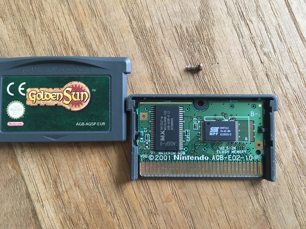
The contrast with the boards below is striking.
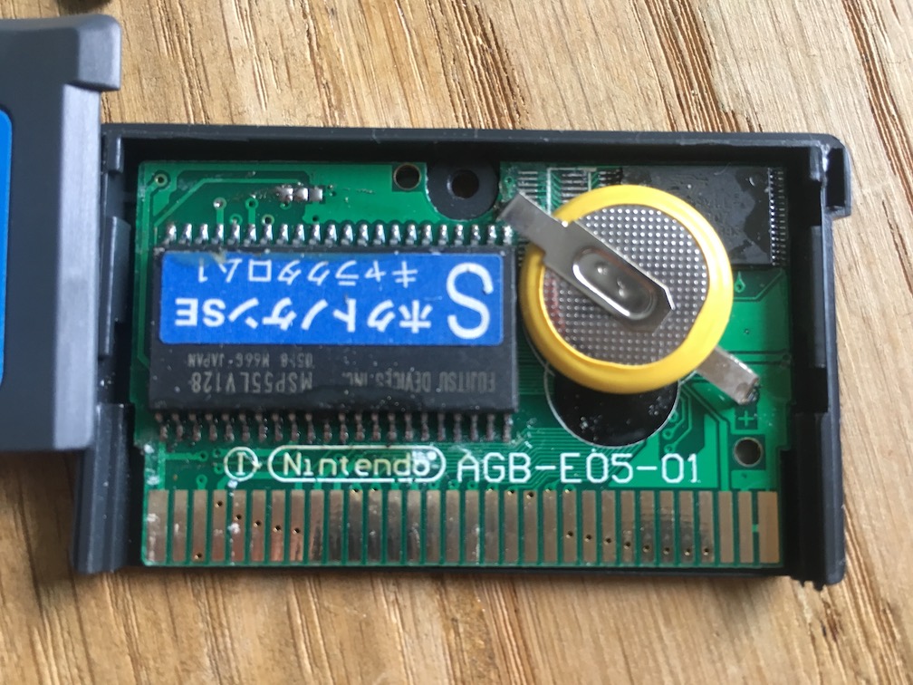
This is the inside of the Metroid Fusion cart. The board is dirty, the fonts and logos are incorrect, there’s even a label on one of the chips (it says something about a ‘North Star’).
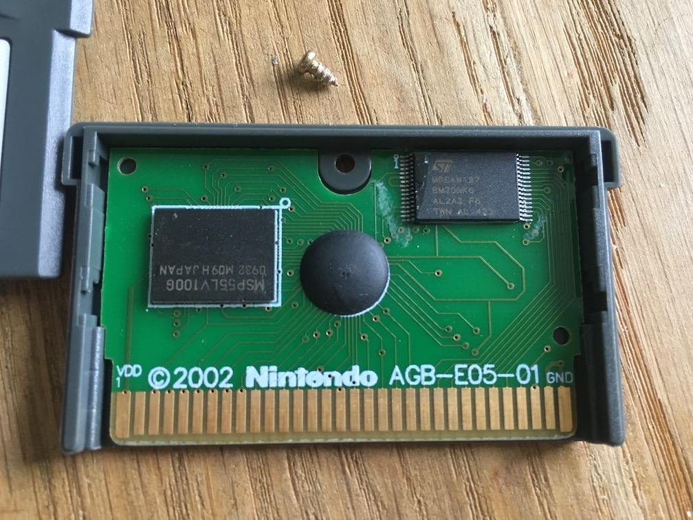
The Final Fantasy VI Advance cart is less dramatic, but a reproduction nonetheless. The Nintendo logo looks awful.
I haven’t decided what I’ll do with these. Either I’ll throw them out, or I’ll drop them off at the local thrift store. Trashing them means somebody else won’t be able to buy (or sell) them anymore.
Distracted by time
It’s widely accepted that there exists a state of mind that allows you to perform exceptionally. Most people call it ‘the zone’ or ‘flow’. Achieving it helps you to get things done almost effortlessly. It’s fragile though; a single distraction can break it.
The clock is one of those distractions for me:
- 10.00 – Only 10 am?? It feels like I’ve been doing nothing for ages.
- 11.30 – Better not start something new because it’ll be lunch time soon.
- 14.00 - Sheesh this day is never going to end…
- 16.00 – It’s already 4 pm?? I did nothing today and it’s too late to start now.
This gets worse when I have appointments throughout the day. The example is a bit extreme, but you catch my drift.
Hiding time
As an experiment, I removed every time indicator from my screen six months ago. The effects are noticeable: I can just sit, work and not care about how the day is progressing. This lack of attachment in turn makes it easier to lose myself in what I’m doing, thus comfortably achieving more.
There are downsides: it also stops me from getting up and do basic things like drink water or getting some fresh air. I work from home and if I’m not careful I skip lunch and scramble to make something for diner because I forgot to buy groceries.
Notifications
Notifications help with this. My calendar and reminders pop up every now and then so I don’t forget anything important. I could start wearing my Apple Watch again to remind me to get up, set additional reminders to help me take proper care of myself and do mundane tasks during the day.
That’s a bit much, I think. It would make me feel like a robot.
Timeless
I’m working on a more natural way of getting the most out of my day: it’s an app called Timeless. At its core it gives me a generic sense of what part of the day I’m in: morning, lunch time, noon etc.
Instead of breaking concentration or induce stress it lets me continue working when I’m still in the time range I’m expecting to get stuff done. Then, in a glance, it lets me know that I’ve entered a new part of the day. If it’s between 12pm and 2pm I should probably get lunch.
There’s no notification to ‘get lunch now’, just a hint that when I’m ready I should probably go grab something to eat.
Even when combined with more urgent interruptions, like water breaks, it allows me to comfortably get back to work. I don’t feel any pressure or hesitance because of how much time I have left in the day.
Beta sign-up
I’m getting ready to let others give this a go as well. If you’d like to be invited to try the beta, subscribe to the mailing list. Thanks!
I make apps, take a look 👇
Beautiful images of code
Generate gorgeous, highly customizable images from your code snippets. Ready to save or share.