Related content with Jekyll and other Liquid tricks
This article originally appeared on dangercove.com
As promised, in this second part of the website redesign story I’ll go over the technical details of the changes I made to dangercove.com.
Stack & frameworks
To get a sense of how the website’s built, here’s an overview of what I use to layout and serve its content.
It’s a simple setup. The entire site is statically generated by Jekyll and then served by Netlify. Bulma is a CSS framework that allows me to style templates quickly.
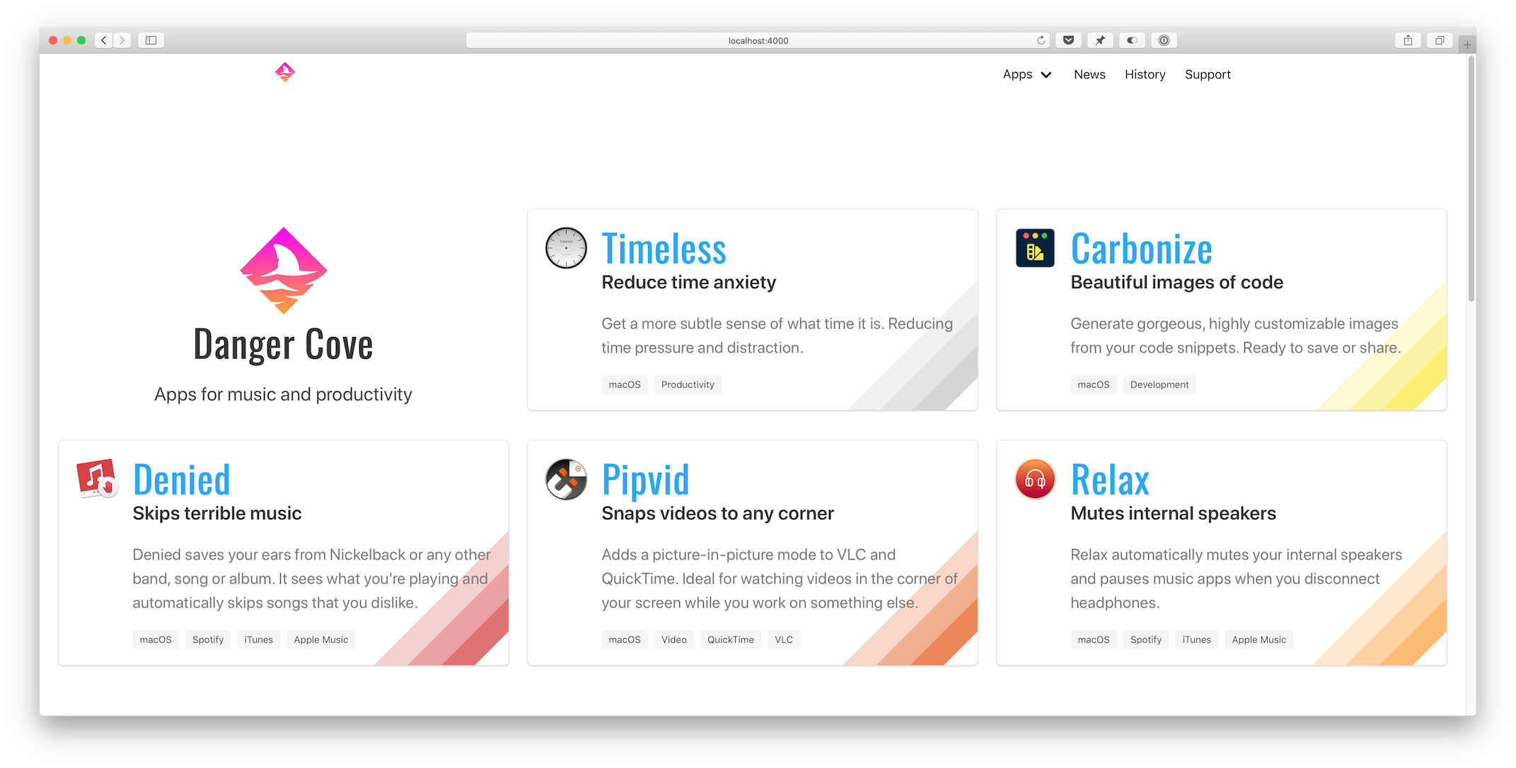
Homepage
Let’s take a look at the homepage first. The list of apps is generated by including the app/overview.html template and assigning it a set of apps pages.
{% assign live = site.pages | where: 'layout', 'app/live' %}
{% assign announced = site.pages | where: 'layout', 'app/announced' %}
{% assign apps = announced | concat: live %}
{% include app/overview.html apps=apps %}
I fetch the apps to display by querying site.pages for pages that use the app/live and app/announced layout. Then I concatenate both arrays into a single apps variable and pass that to the includable app/overview.html template.
Overview template
The app/overview.html template checks if it’s on the homepage (if page.layout == "home") and adds the Danger Cove logo accordingly.
...
{% if page.layout == "home" %}
<div class="column is-4-widescreen is-half-desktop is-full-tablet is-full-mobile">
  <div class="box is-shadowless has-text-centered">
    {% include logo/retro.html %}
    <h1 class="title is-size-2-mobile is-1 is-spaced">{{ page.title }}</h1>
    <h2 class="subtitle is-size-5-mobile is-4">{{ page.subtitle }}</h2>
  </div>
</div>
{% endif %}
...
Then it loops over the provided apps and includes app/introduction.html for each. This is the actual visual representation of the app, in the form of a card. Pulling it out into a separate include makes it trivial to display the app card anywhere else. I’ll use it again when showing related apps with blog posts. More on that a little further down.
...
{% for app in apps %}
<div class="column is-4-widescreen is-half-desktop is-full-tablet is-full-mobile">
  {% include app/introduction.html app=app %}
</div>
{% endfor %}
...
Notice the convenient column CSS classes that Bulma provides. It’s trivial to scale the layout from mobile to widescreen devices.
Front matter
The app/introduction.html template pulls the title, subtitle, description and colors from the app’s front matter. This is what the front matter for Timeless looks like:
---
layout: app/announced
site_title: Don't get distracted by time
title: Timeless
subtitle: Reduce time anxiety
description: >-
  Get a more subtle sense of what time it is. Reducing time pressure and distraction.
date: 2018-07-18
icon: timeless-clock_512.png
hero:
  icon: timeless-clock_512.png
  dominant_color:
    r: 200
    g: 200
    b: 200
features:
  - Specify several, customizable 'time segments'.
  - Indicates the current segment in the menu bar.
  - Display the actual time and date with a single click.
tags:
  - macOS
  - Productivity
topic: timeless
mailchimp:
  interests: [2]
permalink: /timeless/
---
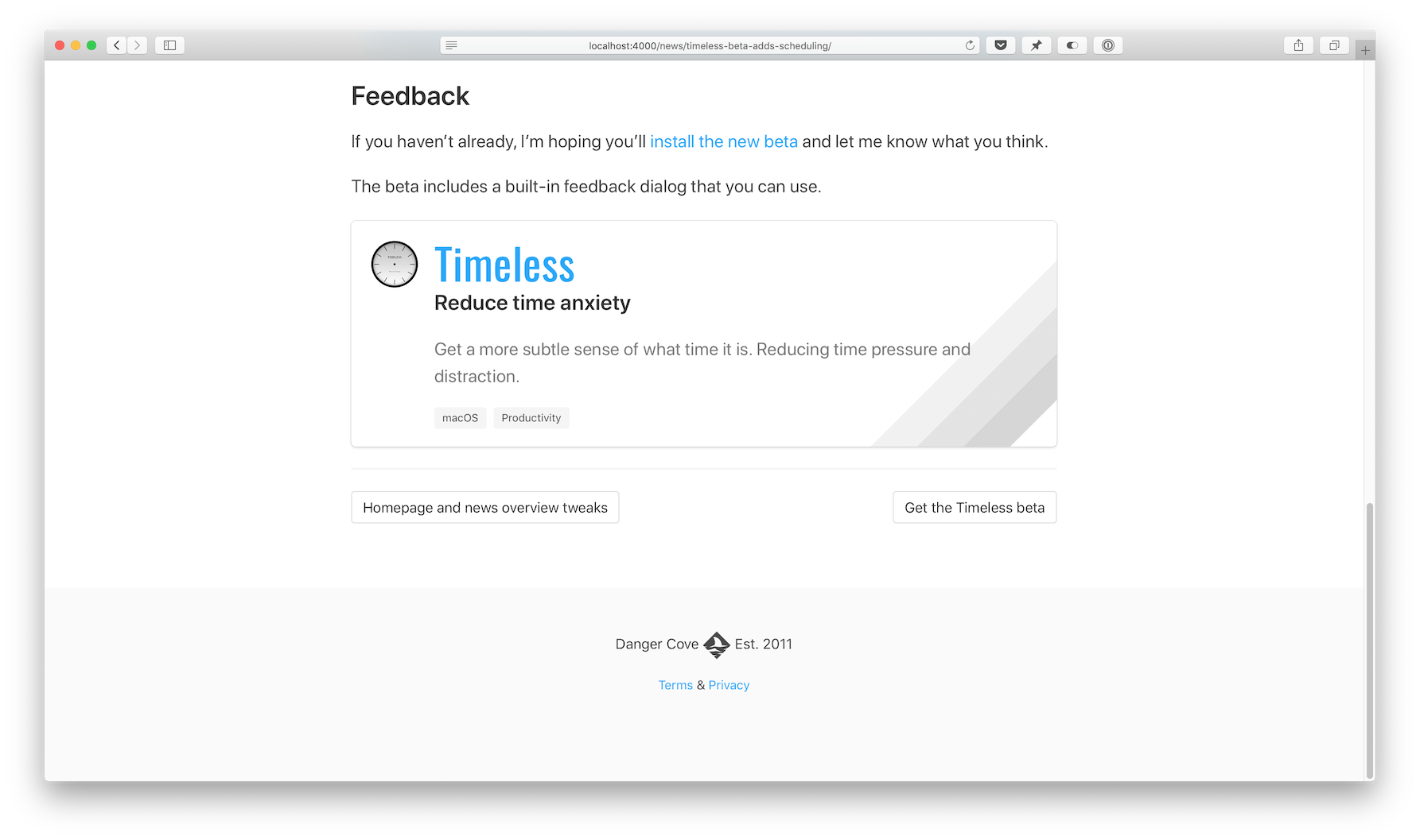
Every card shows a specific rainbow of colors in its bottom right corner. Storing this information in the page’s front matter allows me to pull it out in the template and apply per-app design details.
{% assign color = app.hero.dominant_color %}
<div class="box" style="background-image: linear-gradient(135deg,
transparent 80%,
rgba({{ color.r }}, {{ color.g }}, {{ color.b }}, 0.25) 80%,
rgba({{ color.r }}, {{ color.g }}, {{ color.b }}, 0.25) 85%,
rgba({{ color.r }}, {{ color.g }}, {{ color.b }}, 0.5) 85%,
rgba({{ color.r }}, {{ color.g }}, {{ color.b }}, 0.5) 90%,
rgba({{ color.r }}, {{ color.g }}, {{ color.b }}, 0.75) 90%,
rgba({{ color.r }}, {{ color.g }}, {{ color.b }}, 0.75) 95%,
transparent 95%)
;">
...
It’s hard to get around using style="" for this loop. On the app’s landing pages I apply the colors to a generic CSS class that I can use in the template.
...
{% if page.hero.dominant_color %}
{% assign color = page.hero.dominant_color %}
<style>
  .hero-app {
    background: linear-gradient(35deg,
    transparent 60%,
    rgba({{ color.r }}, {{ color.g }}, {{ color.b }}, 0.25) 60%,
    rgba({{ color.r }}, {{ color.g }}, {{ color.b }}, 0.25) 70%,
    rgba({{ color.r }}, {{ color.g }}, {{ color.b }}, 0.5) 70%,
    rgba({{ color.r }}, {{ color.g }}, {{ color.b }}, 0.5) 80%,
    rgba({{ color.r }}, {{ color.g }}, {{ color.b }}, 1) 80%,
    rgba({{ color.r }}, {{ color.g }}, {{ color.b }}, 1) 90%,
    transparent 90%);
  }
...
Setting class="hero-app" atomatically applies the rainbow background for each app.
News overview
Before: 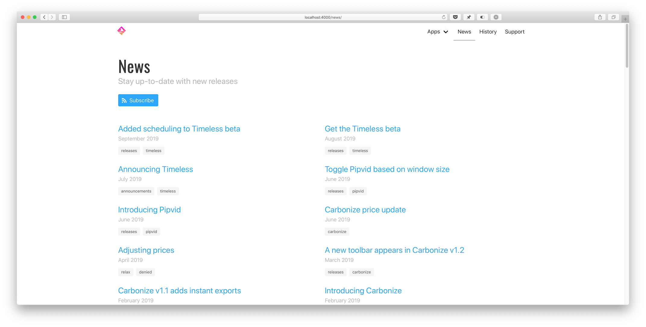 After:
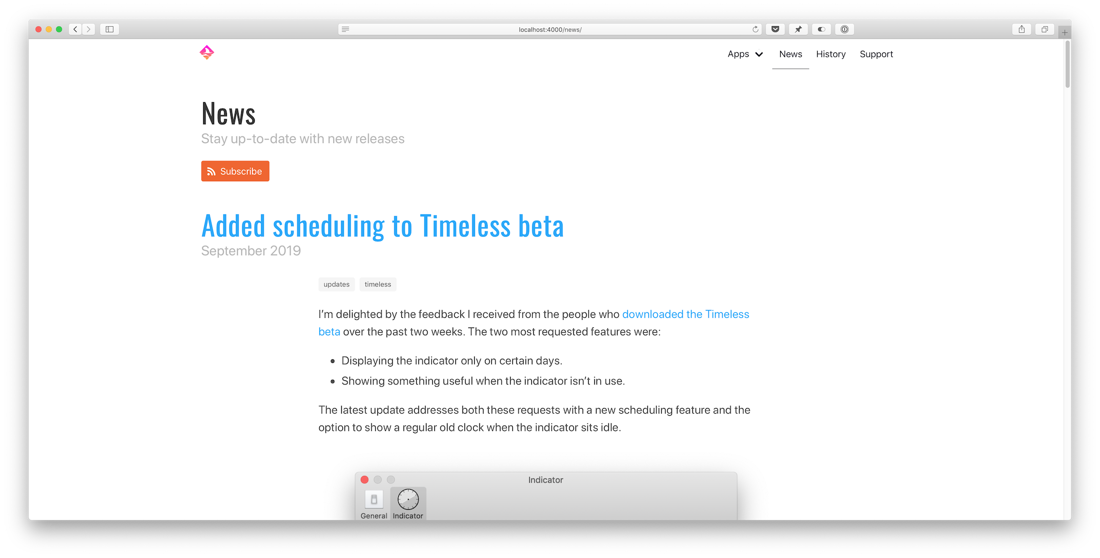
Pagination
Loading all posts on the /news page would be madness. The first step I took was to implement the jekyll-paginate-v2 plugin:
- Add
gem "jekyll-paginate-v2"toGemfile:group :jekyll_plugins do ... gem "jekyll-paginate-v2" end - Activate the plugin in
_config.yml:plugins: ... - jekyll-paginate-v2 pagination: enabled: true sort_reverse: true # Required in my setup to order posts from new to old permalink: "/page/:num/" - Add pagination settings to the
news.markdownfront matter:--- ... pagination: enabled: true per_page: 5 ---
The pagination plugin is ready to be implemented in _layouts/news/home.html at this point. It comes down to two things:
- Replacing
{% for post in site.posts %}with{% for post in paginator.posts %}in the template. - Including the paginator controls somewhere on the page.
Full post content
I updated _includes/post/preview.html to show the entire post instead of just a preview. That’s it.
Related apps
This new feature uses some front matter magic to allow me to pull in related content with a blog post. Consider the _includes/post/related.html template:
{% assign tags = include.tags %}

{% for tag in tags %}
{% assign app = site.pages | where: 'topic', tag | first %}
{% if app %}
{% include app/introduction.html app=app %}
{% endif %}
{% endfor %}
Usage: {% include post/related.html tags=post.tags %}
It loops through all tags assigned to a post and then searches site.pages for a page that has a topic that matches the tag.
Imagine I write a post about Timeless and tag it like this:
---
...
tags: [updates, timeless]
...
---
If you look in the front matter for Timeless above, you’ll notice its topic:
---
...
topic: timeless
...
---
The app variable gets assigned and the app/introduction.html card template gets included. If the tags include multiple apps, each is shown.
Open-source
The full source code for dangercove.com is available on GitHub. For a comprehensive list of all changes made for this redesign, take a look at this diff: 3493aae..4518428
I hope you enjoyed this in-depth look at how I keep dangercove.com up-to-date. If you have any feedback, questions or comments let me know on Twitter.
I make apps, take a look 👇
Beautiful images of code
Generate gorgeous, highly customizable images from your code snippets. Ready to save or share.